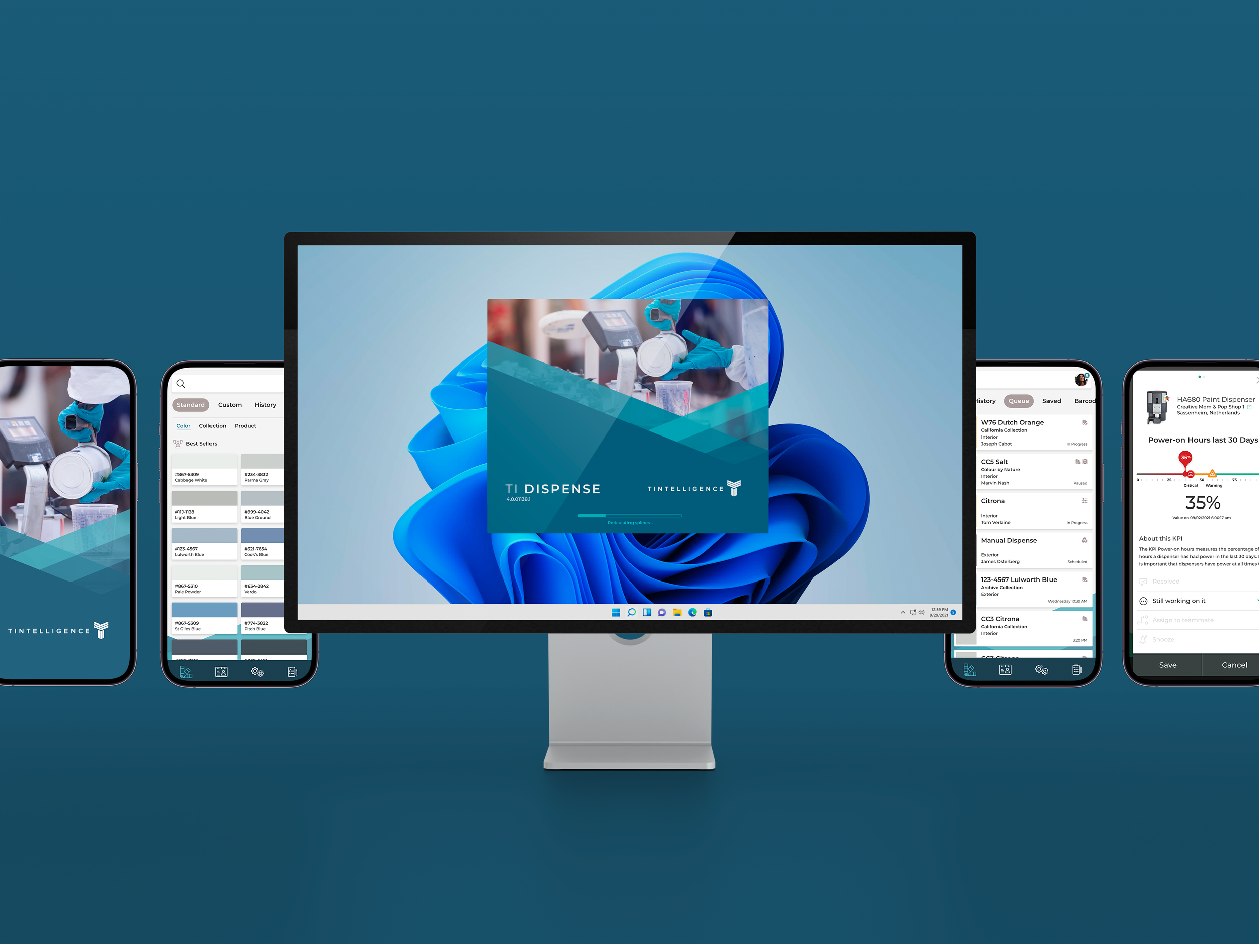
Color Tinting Application Ecosystem.
Design for a complete family of applications for a color tinting company. Based on a then still-emerging identity system, these designs were built to extend that language in meaningful ways while remaining true to the established styles.

One ecosystem. Many applications.


Key to the initial effort was interacting with an existing, external branding agency developing the overall design language for the client’s new brand. Their deliverables included a new logo, color palette, and type palette, as well as suggestions for how the new identity might translate to individual app icons.
The challenge, then, was taking these initial cues and building a cohesive look and feel overall that allowed each application to be visually unique, but still appear related to the others. The end result took cues from other app ecosystems like Microsoft Office and Adobe Creative Cloud, specifically how color was used as a key variable in an otherwise consistent framework.


