Identity Design for a Public Education Department.
Redesign effort for the State of Nevada Department of Education. Done in parallel with a content strategy and information design effort, led the client through brand ideation workshops to develop consensus, identify unifying principles and aspirations to guide them through 4 iterative rounds of concepts and refinement.
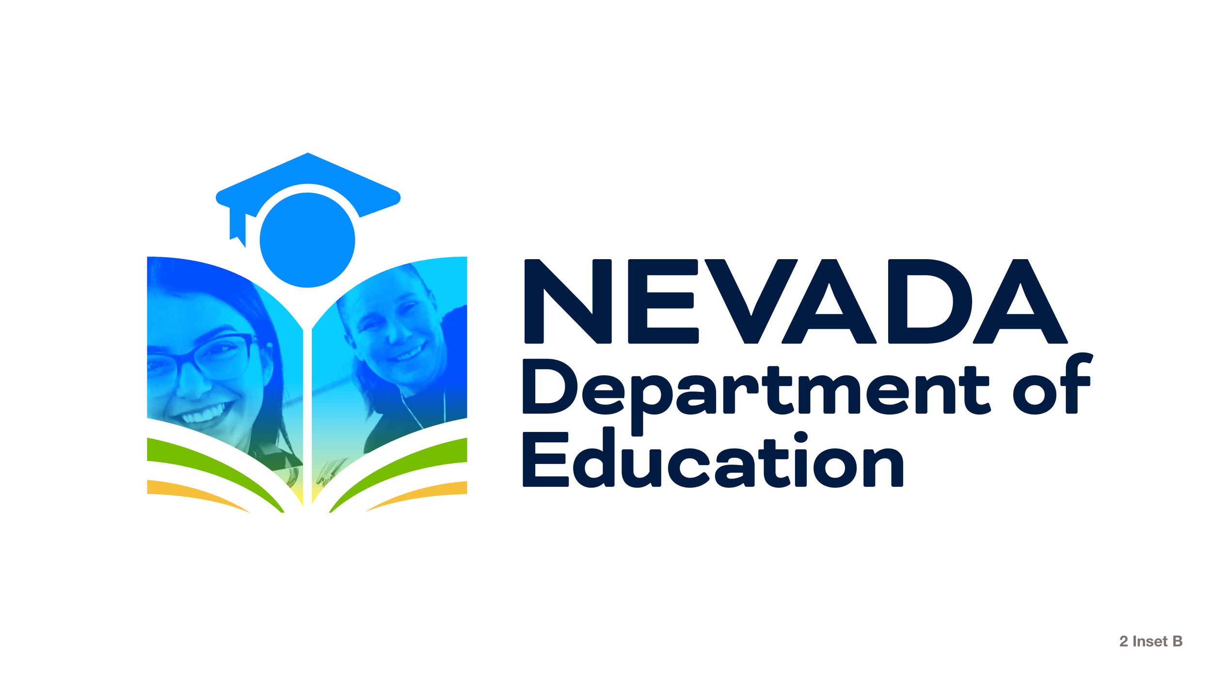
The new mark was created as part of an identity system, with the addition of new color and typography palettes, brand guidelines, and a prospective design for a new homepage, incorporating the learnings from the parallel information design effort.

It begins with research

A huge challenge for the client was that their existing mark was designed by a single person internally, without input from the organization as a whole.
Principle stakeholders were identified immediately, and I ran multiple workshop sessions, running participants through a series of exercises designed to get them to express their aspirations, core beliefs, tone, attitude, and for want of a better term, vibe.
All of this is key in ensuring the right people have a say in feeding what should ultimately be distilled into a graphic system.

Take it step by step
As with any logo process, work begins broadly, through a wide set of varied concepts. With each iteration the candidates are narrowed, finer and finer details are honed, and consensus grows.
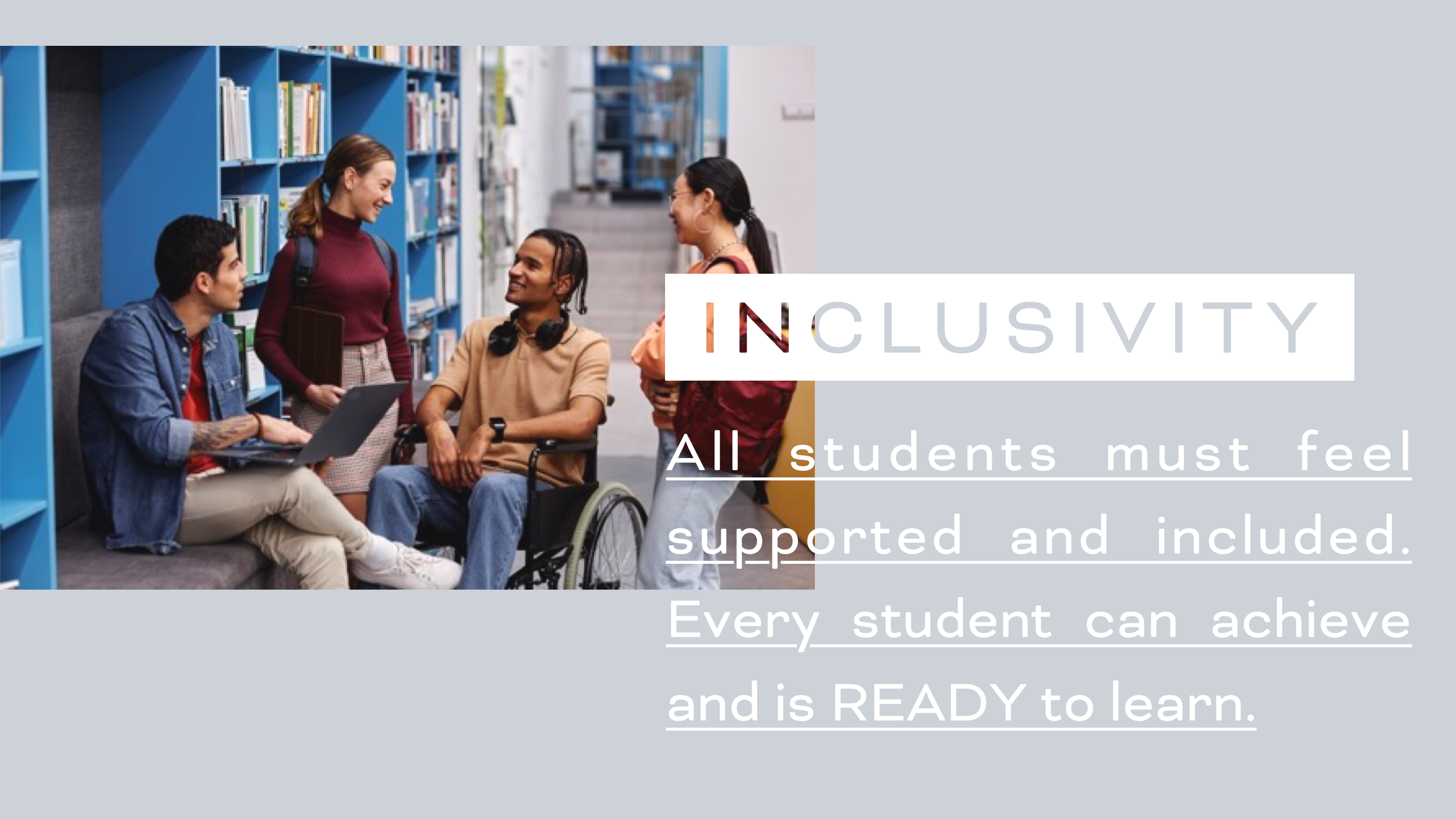
Each starting point begins with a story to tell. The final candidate is designed not solely as a mark but a flexible system, one which is designed to incorporate faces of the organization and community, in an effort to garner engagement and a sense of personal investment.


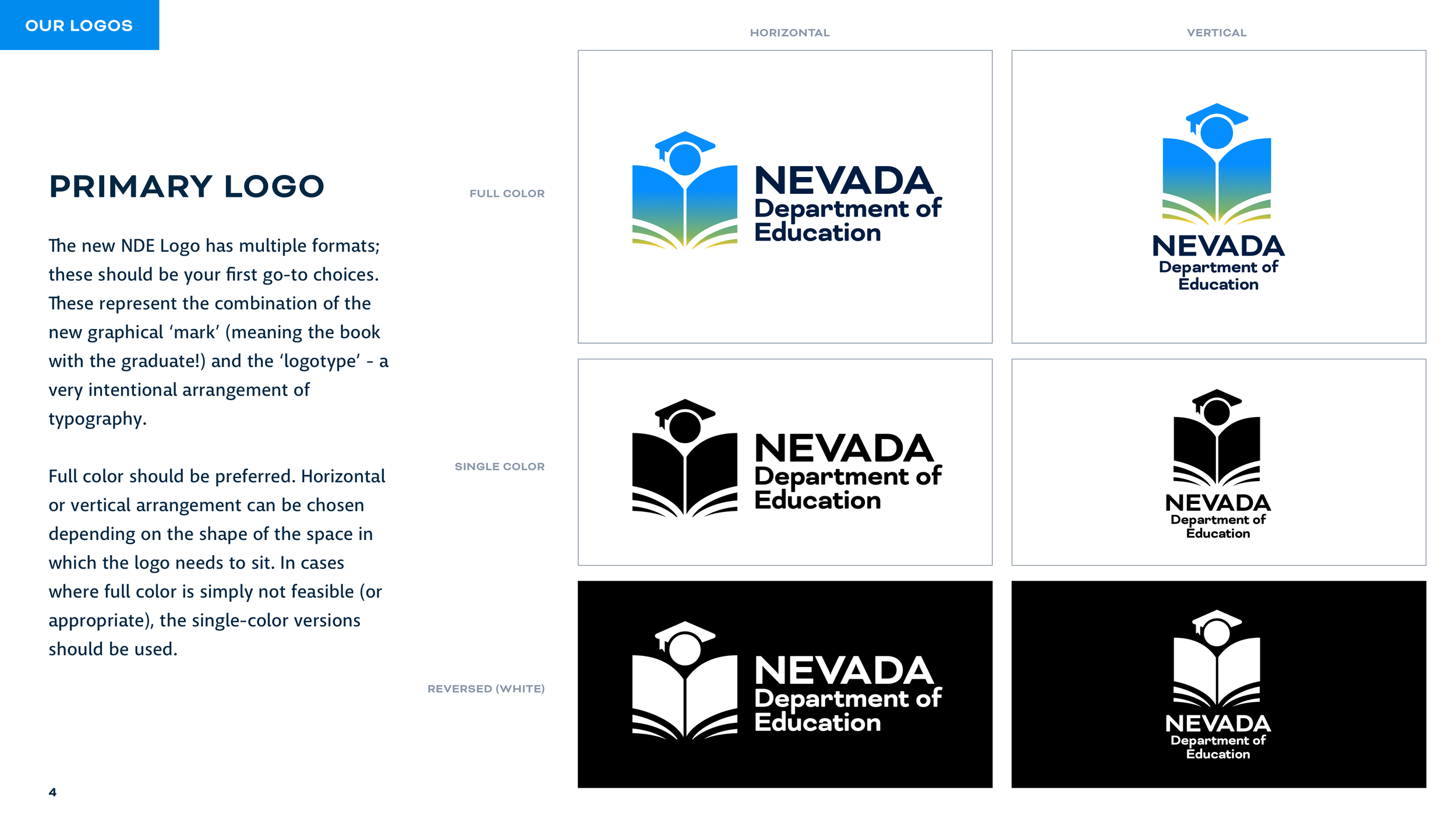


The end result is a full set of brand standards, including usage guidelines, color and typography palettes, a full complement of lockups, and a set of tone-setting samples to demonstrate how they might all come together.